Seismic Wavelet Processing
Table of contents
- Introduction
- Vibrator Sweep
- FFT in Python
- Amplitude and Phase spectrum
- Pilot Sweep Autocorrelation
- Converting to minimum phase filter
- Minimum Phase Filter Spectrums
Introduction
The seismic wavelet is the combination of the wavelet transmitted into the earth, modified by the earth’s transmission, and then by the instruments responses. Then, the wavelet processing describes what is done to alter the wavelet so that it is short, well-behaved, and more useful for interpretation. I will introduce some basics on seismic wavelet processing showing Python codes examples using the seismic sweep from a Land vibrator.
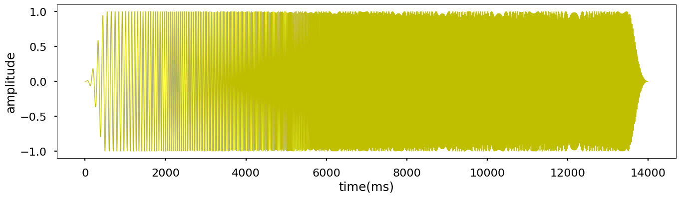
Vibrator Sweep
An encoded swept-frequency signal (called pilot sweep) transmitted from the vibrator control unit (VCU) in the recording truck to similar units in each vibrator truck. For the following steps I used a time series sweep in ‘.csv’ format can be found in ./data folder.
The sweep parameters are the following:
- sweep length: 14 seconds
- start frequency: 6 Hz
- end frequency: 95 Hz
Function below simply plot the sweep using Matplotlib Python library.
import pandas as pd
import matplotlib.pyplot as plt
import numpy as np
import seaborn as sns

def plot_sweep(file):
    plt.style.use('seaborn-poster')
    %matplotlib inline
    df = pd.read_csv(file)
    plt.figure(figsize = (16, 4))
    plt.plot(df['TIME'], df['AMPLITUDE'])
    plt.xlabel('time(ms)')
    plt.ylabel('amplitude')
    plt.show()
plot_sweep('sweep.csv')
FFT in Python
Let’s calculate the amplitude and the phase spectrum of our sweep. The amplitude and phase spectrums are obtained by converting the signal from time domain to frequency domain. In programming the Fourier Transform needs to be in a discrete form given by:
\[X(k) = \sum_{n=0}^n x(n) e^{-i2 \pi kn \over N}\]where, $k$ is the index of the $k_{th}$ frequency point, where $f_k$ = $k f_s \over N$, $f_s$ is the frequency sampling of the signal.
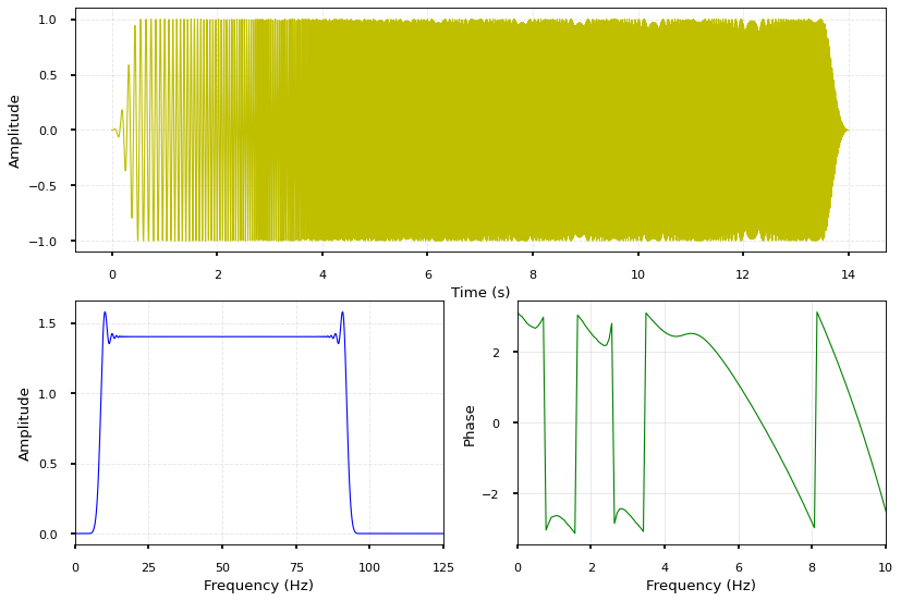
Amplitude and Phase Spectrum
In the Python code, I justt called the methods of libraries Numpy and Scipy in Python to implement the amplitude and phase spectrums as below:
from numpy.fft import fft, ifft
import numpy as np
import pandas as pd
import matplotlib.pyplot as plt

plt.style.use('seaborn-poster')
%matplotlib inline

dt = 0.002
t = np.arange(0, 14.002, dt)
signal = pd.read_csv('sweep.csv')['AMPLITUDE']
minsignal, maxsignal = signal.min(), signal.max()

## Compute Fourier Transform
n = len(t)
fhat = np.fft.fft(signal, n) #computes the fft
psd = fhat * np.conj(fhat)/n
freq = (1/(dt*n)) * np.arange(n) #frequency array
idxs_half = np.arange(1, np.floor(n/2), dtype=np.int32) #first half index

# Another approch to get the Fourier Transform of s
fd = np.fft.fft(signal) / n * 2
# The amplitude spectrum.
fa = abs(fd)
# The phase spectrum.
fp = np.arctan2(fd.imag, fd.real)
#fp = np.arctan2(fhat.imag, fhat.real)
fs = 1/dt

plt.figure(figsize=(12, 8), dpi=80)
plt.subplot(211)
plt.plot(t, signal, color='r', lw=1, label='Sweep Signal')
plt.grid(linestyle='--', linewidth=0.8, alpha=0.3)
plt.xlabel('Time (s)', fontsize=12)
plt.ylabel('Amplitude', fontsize=12)
plt.xticks(fontsize=10)
plt.yticks(fontsize=10)

plt.subplot(2, 2, 3)
plt.plot(freq[idxs_half], np.abs(psd[idxs_half]), color='b', lw=1, label='Amplitude Spectrum')
plt.grid(linestyle='--', linewidth=0.8, alpha=0.3)
plt.xlim(0, fs/4)
plt.xlabel('Frequency (Hz)', fontsize=12)
plt.ylabel('Amplitude', fontsize=12)
plt.xticks(fontsize=10)
plt.yticks(fontsize=10)

plt.subplot(2, 2, 4)
plt.plot(freq, fp, lw=1, color='g')
plt.grid(linewidth=0.8, alpha=0.3)
plt.xlim(0, 10)
plt.xlabel('Frequency (Hz)', fontsize=12)
plt.ylabel('Phase', fontsize=12)
plt.xticks(fontsize=10)
plt.yticks(fontsize=10)

plt.show()
The plots below show the corresponding amplitude and phase spectrums of our sweep.
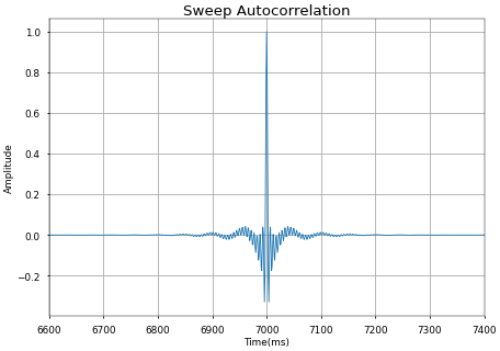
Pilot Sweep Autocorrelation
Let’s check the correlation of the pilot sweep with itsel Autocorrelation. The code below does the autocorrelation of the sweep.
import scipy.signal
from numpy.fft import fft, ifft
import numpy as np
import pandas as pd
import matplotlib.pyplot as plt
%matplotlib inline

t = np.arange(0, 14.002, dt)

''' 1ST METHODE USING Numpy'''
corr = np.correlate(signal, signal, mode='full')
corr /= np.max(corr) # To get 1 as max amplitude at full correlation

''' 2ND METHODE USING Scipy '''
#corr = scipy.signal.correlate(signal, signal, mode='full', method='auto')
#corr /= np.max(corr) # To get 1 as max amplitude at full correlation

plt.figure(dpi=40)
#plt.acorr(signal, maxlags = 100)
plt.xlim(6600, 7400)
plt.grid(True)
plt.xlabel('Time(ms)', fontsize=16)
plt.ylabel('Amplitude', fontsize=16)
plt.title('Sweep Autocorrelation', fontsize=24)
plt.plot(corr, lw=1.5)
plt.show()
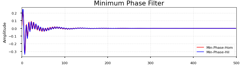
Converting to minimum phase filter
In this section, I will do a simple manipulation of converting our wavelet “Sweep Autocorrelation” into a minimum phase filter, then calculate the FFT of the signal to output the amplitude and phase spectra.

For the conversion to minimum phase, I compared two methods from Scipy Python library; Homomorphic and Hilbert.
The documentation of these two methods can be found here.
import numpy as np
from scipy.signal import remez, minimum_phase, freqz, group_delay
import matplotlib.pyplot as plt

h_min_hom = minimum_phase(corr_function, method='homomorphic')
h_min_hil = minimum_phase(corr_function, method='hilbert')
fig, axs = plt.subplots(4, figsize=(10, 12), dpi=80)
for h, style, color, linewidth, in zip((corr_function, h_min_hom, h_min_hil),
                           ('-', '-', '-'), ('b', 'r', 'c'), (1.5, 1.5)):
    w, H = freqz(h)
    w, gd = group_delay((h, 1))
    w /= np.pi
    axs[0].plot(corr_function, color='c', linewidth=linewidth)
    axs[1].plot(h_min_hom, color='r', linestyle=style, linewidth=linewidth)
    axs[1].plot(h_min_hil, color='b', linestyle=style, linewidth=linewidth)
    axs[1].set(xlim=[0,500])
    axs[1].set(title='Minimum Phase Filter')
    axs[2].plot(w, np.abs(H), color=color, linestyle=style, linewidth=linewidth)
    axs[3].plot(w, 20 * np.log10(np.abs(H)), color=color, linestyle=style, linewidth=linewidth)
for ax in axs:
    ax.grid(linestyle='--', linewidth=1, alpha=0.3)

axs[0].set(xlim=[0, len(corr_function) - 1], ylabel='Amplitude', xlabel='Samples')
axs[1].set(ylabel='Amplitude', xlabel='Samples')
axs[0].legend(['Sweep Autocorrelation'], fontsize='medium', loc=4)
axs[1].legend(['Min-Phase-Hom', 'Min-Phase-Hil'], fontsize='medium', loc=4)

for ax, ylim in zip(axs[2:], ([0, 1.6], [-150, 10])):
    ax.set(xlim=[0, 1], ylim=ylim, xlabel='Frequency (Hz)')
    ax.legend(['Min-Phase-Hil', 'Min-Phase-Hom'], fontsize='medium', loc=4)

for ax in axs:
    ax.xaxis.label.set_fontsize(12)
    ax.yaxis.label.set_fontsize(12)
    ax.xaxis.set_tick_params(labelsize=10)
    ax.yaxis.set_tick_params(labelsize=10)

axs[2].set(ylabel='Magnitude')
axs[3].set(ylabel='Magnitude (dB)')
plt.tight_layout()
Minimum Phase Filter Spectrums
This displays show respectively, 1) the sweep autocorrelation, 2) the minimum phase calculation, 3) the amplitude spectrum and 4) the phase spectrum.
Get help: Post in our discussion board • Review the GitHub status page
© 2022 GitHub • Code of Conduct • CC-BY-4.0 License
Please leave your comments and suggestion for us to improve … 🙂